Continuing in the beard-scratching theme of Unix related posts (previously - awk), here’s a way to graph out the I/O profile of your Oracle database via the Oracle metrics in gv$sysstat, and gnuplot. This is only the system I/O as observed by Oracle, so for belts & braces (or to placate a cynical sysadmin ;-)) you may want to cross-reference it with something like sar.
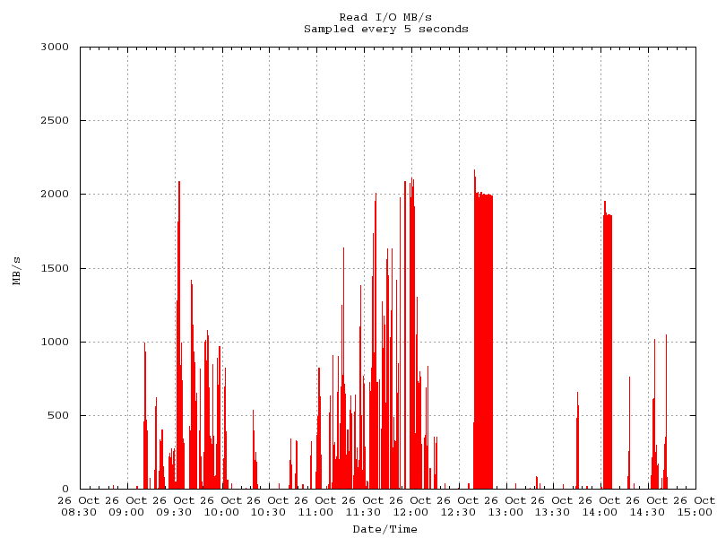
First, a pretty picture of what you can get:

Why would you want to do this when you’ve got a pretty GUI in EM/Grid and flash graphs? Because the data in EM is averaged out over a relatively large sample (one minute for recent history, and whatever your AWR samplerate is for older history) and thus lower than the point-in-time I/O being driven through your server. My previous post (The danger of averages) illustrates this. For identifying bottlenecks or capacity planning, you need to know how much I/O throughput you really use. Consider this rough example: Using V$SYSMETRIC_HISTORY you can get an average over the last minute. For the first 30 seconds of this sampled minute you ran a query consuming I/O at 100 MB/s. For the last 30 seconds there was no system activity. V$SYSMETRIC_HISTORY shows a figure of 50 MB/s, as this is the average over a minute. You look at your system’s IO profile in EM and see 50 MB/s. Your hardware guys tell you that the system has a capacity of 100 MB/s throughput, so you think you’re well in the clear for capacity, when in reality you’re already hitting it. Now, what happens when two instances of this same query - each requiring 100 MB/s - runs? It will take twice as long when run concurrently (because they’ll have to share the throughput available, and thus get ~50 MB/s). It might be that this is acceptable, that the trade-off of hardware cost to increase I/O throughput capacity isn’t justifiable for making the queries run faster. But it’s important to be aware of the bottlenecks in a system so that they can be mitigated and considered in any capacity planning.
So, anyway, back to the point of this post:
Kevin Closson’s written a neat script here which will write out IO metrics from gv$sysstat to a flat file on the Oracle host. It looks like this:
[sourcecode] 2010-10-26-09:09:58|1|1|0| 2010-10-26-09:10:03|0|0|0| 2010-10-26-09:10:08|51|51|0| 2010-10-26-09:10:13|87|87|0| 2010-10-26-09:10:19|108|108|0| 2010-10-26-09:10:24|118|118|0| 2010-10-26-09:10:29|116|117|0| 2010-10-26-09:10:34|451|454|0| 2010-10-26-09:10:39|692|694|0| 2010-10-26-09:10:44|894|895|2| 2010-10-26-09:10:49|875|879|1| 2010-10-26-09:10:54|990|990|2| 2010-10-26-09:10:59|922|920|1| 2010-10-26-09:11:04|768|765|2| [/sourcecode]
I wanted a quick way to visualise the data, and also to plot it out once it was over the number of rows that Excel will chart at once (32k I think). gnuplot was the answer, but it’s a bit of a sod to get running as a fire-and-forget so here’s a help. Here’s how it works:
- For ease of use it copies the file generated by the above script to your local machine. If you don’t want to do that then remove the scp line.
- It uses sed to convert bar (|) characters to Space ( ), as gnuplot requires whitespace separated columns. tr would probably do the job too.
- It uses an inline input to gnuplot, but you could move this to a separate config file if you wanted
- It plots the graph on screen (assuming you have configured X), and also writes it to a png file
[sourcecode language=“bash”] # Download the file from a remote server # Prompts for password, or use ssh key authentication to make it seamless scp user@remotehost:/tmp/io.DBINSTANCE.log . # Convert bar (|) to Space ( ) sed -e ’s/|/ /g’ io.DBINSTANCE.log > io.log # Plot a graph (remove –persist if you don’t want the window displayed) gnuplot –persist «EOF set title “Read I/O MB/s\nSampled every 5 seconds” set xdata time set timefmt “%Y-%m-%d-%H:%M:%S” set format x “%d %b\n%H:%M” set ylabel “MB/s” # You can set the y range to a specific constant based on your IO capacity set yrange [0:3000] set xlabel “Date/Time” unset key set grid plot “io.log” using 1:3 with boxes fs set terminal png font “courier, 10” size 1200,800 set output “io.png” replot EOF [/sourcecode]
This was written on cygwin, and presumably should work on any ’nix system.
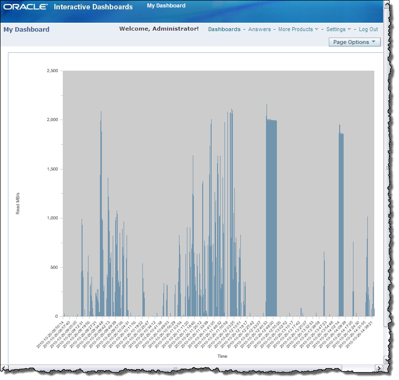
Ob. OBIEE: An alternative to gnuplot would be to graph the data in OBIEE using the text file as source data to a hacked together RPD :-) :

