This post expands on one I made last year here about sampling frequency (of I/O throughput, but it’s a generic concept). The background to this is my analysis of the performance and capacity of our data warehouse on Oracle 11g.
Before I get too boring, here’s the fun bit:
Pork Pies per Hour (PP/h) 🔗
Jim wants to enter a championship pork-pie eating competition. He’s timed himself practising and over the course of an hour he eats four pork pies. So we might say that his Pork Pies per Hour (PP/h) rate is 4.
The competition lasts for thirty minutes. The world champion can eat eight pork pies in thirty minutes. Does Jim stand a chance? (let’s pretend he has an insatiable appetite and isn’t going to get full, and all other smart-ass factors)
If his consumption rate was 4 PP/h, and he only has half an hour, then we would predict he’ll consume 4 * 0.5 = 2 pork pies. So Jim’s going to get his ass beat.
Or is he?
What if the rate of 4 PP/h masks the fact that the hour broke down as follows:
- First 15 minutes: he ate one pork pie
- 15 - 30 minutes: had a beer
- 30 - 45 minutes: gobbled down three pork pies
- 45 - 60 minutes: he had another beer and gently sweated pork fumes?
If that were the case and we had sampled every fifteen minutes, we’d see this:
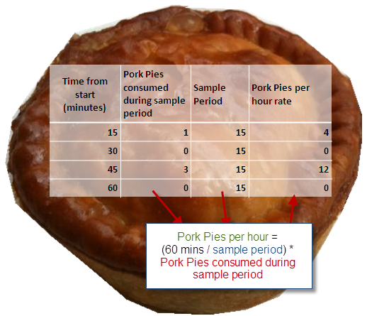
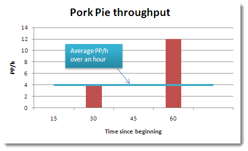
So what we want to know, which is the maximum rate at which he can consume pork pies, is exposed only when we sample at an appropriate frequency.
Mega bites to Mega bytes 🔗
Enough of pork pies, and back to the tasty subject of I/O throughput. The point I am trying to make is that without an appropriate sample size the data that we have becomes less useful.
You can always process your data further to derive conclusions from it over a longer term. Five second samples are going to be fairly unintelligible if considered unprocessed over the timespan of a year.
But what you can’t do is add back in the detail that you lost by sampling with too great a frequency. Once that moment’s passed, it’s gone.
By the nature of metric which is a rate at which something happens, the sample is going to be an average over the sampling period. The problem with this is that it can mask peaks in the throughput. Peaks may (or may not) be hitting a ceiling in your system which an average figure will make you think you are plenty clear of.
System metrics for Oracle are available through AWR, which typically samples every hour. OS-level tools may sample more frequently, but in the context of capacity planning and analysis, periods are often going to be 10s of minutes, or hourly and upwards.
The following illustrates the effect of averaging I/O throughput figures.
The data is the average I/O throughput, sampled every five seconds (through this method). Note that already this is an average, but in the context of hourly samples (for example) we will have to live with five seconds as the starting point.
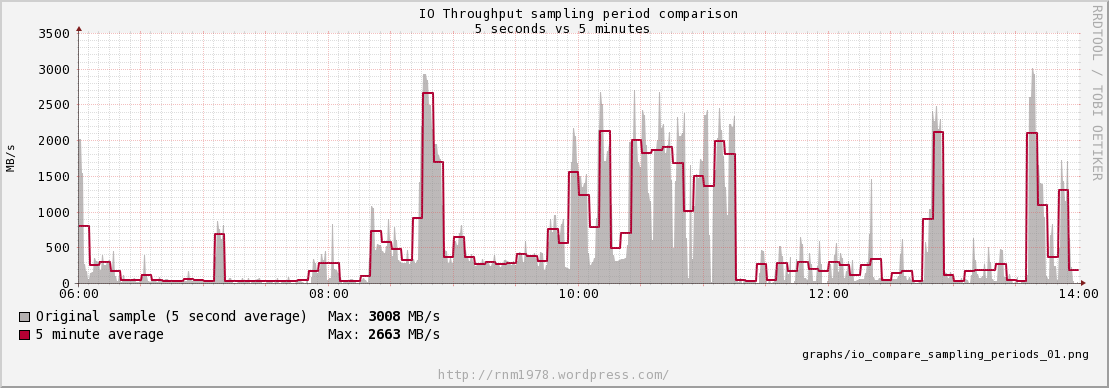
This first graph shows the original data, with a five minute average drawn over it. For each, the maximum is noted. It can be seen that the maximum the I/O throughput hit was a shade over 3GB/s. That was the real maximum that we were driving through the I/O pipe over the period of time (ignoring that it’s a 5-second average). Now look at the maximum of the 5 minute average - we lost c240MB/s in our maximum, which is now 2.7GBs.
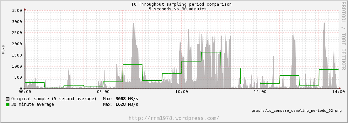
In the second graph the original sample is shown, with a 30 minute average. It’s clear to see the effect of averaging the data has - the peaks and troughs are smoothed out, giving a more even line. But is this what we want? Our apparent maximum I/O based on a 30 minute average has now almost halved! Apparently, we only needed 1.6GB/s of I/O throughput during this time period. The graph clearly shows that this is a false statement. But what about now?
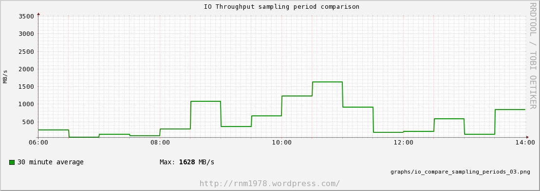
Same graph as before, but without the context of the original sample. Given this data - which is what you’ll have if you collect I/O throughput data that’s sampled every 30 minutes - then how would you know what the maximum throughput during that period was? It is impossible to know!
Pushing this point further, the same 30 minute average, over an extended period:
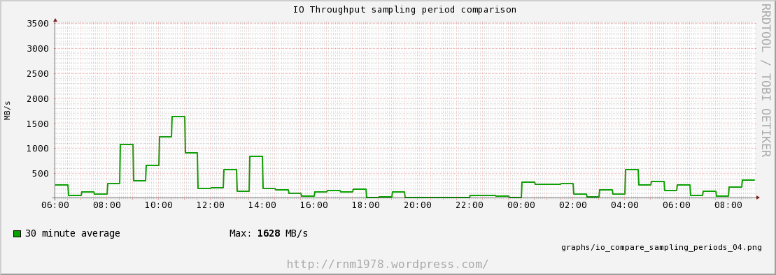
What’s the maximum throughput that was required during this period? When was the I/O throughput approaching capacity? You can’t know from the averaged data alone!
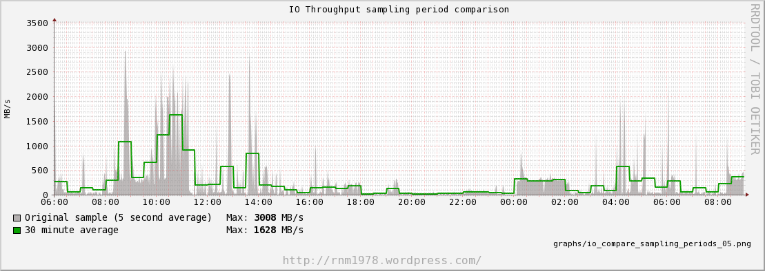
Here’s the same extended period, with the original 5 second samples. This is just proving the point, that the 30 minute samples have obliterated the peaks particularly around 04:00 - 06:00.
So what? 🔗
To be able to plan for a system’s I/O capacity we need to know more than how much I/O it transferred over a relatively long period of time. We need to know what the biggest demand it put on the system was, otherwise we risk unseen bottlenecks. To make this useful, we also need to understand if these big demands were prolonged peaks or not. Particularly in a DW/BI environment, load is generally going to be sporadic. Sure, we run regular batches at predictable times, and may look to cache reports at fixed times, but they’re exceptions not the rule.
If a system has a limit of 3GB/s, and we hit that 3GB/s for a few seconds, what is the implication of that? We need to transfer the same amount of data, so hitting the limit means that the transfer is going to take longer. But a few seconds here and there may not matter – it all comes down to the context.
A report that runs for five minutes which hits I/O throughput limit for a second or two isn’t as much of a concern as one where the I/O hits the limit for minutes on end. There’s plenty written about system capacity and scalability, and it should be clear that if a system is hitting a capacity limit (whether it’s I/O, CPU, or whatever) for prolonged periods then the overall stability is going to suffer. Maybe that five minute report which spends four minutes on bottlenecked I/O doesn’t bother the user, but what about the report that’s supposed to run in a few seconds which is sat waiting for I/O at the same time?
(Ed: I’m pretty sure that I’m straying into the realm of knees and such, but need (knee’d?) to go off an read some more about it first to be sure)
I love twitter 🔗
In writing this, I’ve been struggling with some of the concepts which I can instinctively feel but don’t have the understanding to properly articulate. Particularly, if my assertion is that long sample periods are not a good idea, what is a good sample period? It’s no use being a smart-ass and rubbishing the data we collect if I can’t explain how we should collect it.
So, I turned to twitter. Twitter is awesome. (I think of Chet almost everytime I say this because he was one of the main guys who convinced me it was as good as the fuss made out. Check out his presentation all about it here here).  and back the answers came:
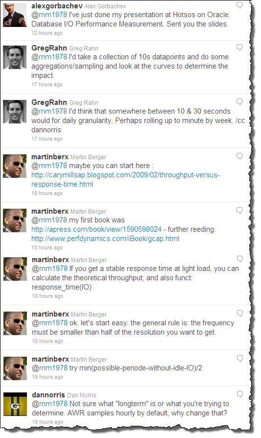
Amazingly helpful stuff, and focussed on my specific question. Sure, Google has changed our lives when it comes to finding the answers to questions. But (a) there is a lot of crap written on the internet (Blunder On So, anyone?), and (b) you will often find generally interesting things in the area in which you are interested, but for the more specific uncommon questions it’s unlikely you’ll get a direct hit.
Here, I had industry-leading figures directly answering my specific question! I love twitter. And I really appreciate experts taking the time to share their knowledge, experience and expertise.
What next? 🔗
Nothing that I’m writing here is new, but I enjoy writing things down to clarify my thoughts.
Courtesy of the good folk of twitter, I have some great links to follow up and digest.
- Monitoring System Performance With Orca, RRDtool, and the SE Toolkit
- Forecasting Oracle performance - Craig Shallahamer
- Guerrilla Capacity Planning - Dr. Neil Gunther
- Throughput versus Response Time - Cary Millsap
- Database I/O Performance: Measuring and Planning - Alex Gorbachev
- I started reading this today and am already scrawling huge “YES!” comments next to lots of it. I’d strongly recommend anyone trying to understand this subject get hold of a copy of the presentation, because it explains what I’ve rambled on about above in a much more clear and eloquent way.
