Excel may send chills down the spine of us when we hear users talking about its [ab]use, but it has its place in the toolset. For my money, it is a very good tool for knocking out graphs which look decent. Of course, rrdtool is my geek tool of choice for dynamic long-term graphing, but when doing scratch PoC work, I normally fall back to Excel.
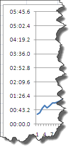
One thing which has frustrated me over time is, well, time, and Excel’s handling thereof. How many times (these puns are getting tiresome already) have you seen an axis like this and gnashed your teeth? 
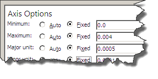
Looking at the axis options shows some decimals, with no apparent bearing on the times shown on the axis: 
By virtue of using Excel for quick ’n dirty graphing, I normally don’t have the time to figure this out properly. I finally cracked, and I’m glad I did. The answer is very simple.
Time’s in Excel are based on fractions of 1 day. So, with a number of 1 = 24 hours, we can work backwards:
- 1/2 is going to be half a day, twelve hours = 0.5
- 1/24 = one hour = 0.04166666666667
- 1/24/2 = Half an hour = 0.02083333333333
- 1/24/2/2 = Quarter of an hour = 0.010416666666666667
- 1/24/60 = One minute = 0.000694444444
This is a good example of understandable backend functionality (storing times as a plain number) ought to be shielded from the end user, and the interface design has fallen one step short. Excel knows the data is Time, and good interface would at the very least offer the option to define axes in terms of time, if not hide the decimals entirely.
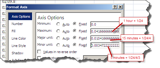
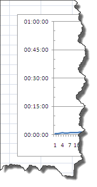
Still, making use of what we have, we can still get Excel to behave, it’s just a bit labourious: You want a graph with a maximum of 1 hour, major lines every fifteen minutes, and minor at 5 minutes? No problem. 

So next time you’re graphing a time series in Excel, fire up Calc and work out your fractions, for some proper time axis labelling.
