In this article I’m going to show you how to easily monitor the rate at which Logstash is ingesting data, as well as in future articles the rate at which Elasticsearch is indexing it. It’s a nice little touch to add to any project involving Logstash, and it’s easy to do.
Logstash is powerful tool for data ingest, processing, and distribution. It originated as simply the pipe to slurp at log files and put them into Elasticsearch, but has evolved into a whole bunch more. With connectors to JDBC and Kafka, as well as many other input and output options (not to mention the filtering possibilities), it really is a great bit of software to use. I’ve used it over the years with OBIEE, as well as more recently to pull data from Oracle, and even IRC. Another great set of tools is InfluxDB and Grafana, which for me really round off the standalone Elastic platform (previously known as ELK - Elasticsearch, Logstash, and Kibana). What InfluxDB and Grafana give is a powerful dedicated time series database and flexible time series-based dashboarding tool respectively. A topic for another day is the Elasticsearch vs InfluxDB overlap, and Kibana vs Grafana - but for now, just take it as read that it’s horses for course, right tool for the right job, etc.
Let’s get started…
Pre-Requisites 🔗
I’m not going to cover setup & install here - I’m assuming that you’ve got Logstash >=2.3.1, InfluxDB >= 0.12, Grafana >= 2.6 running. In this example it’s all running on a single node, localhost, default ports for everything. The only non-standard configuration is that I’ve enabled the graphite listener in InfluxDB.
Overview 🔗
We’ll get Logstash to send event rates over to InfluxDB, from where we’ll visualise it in Grafana.
The example I’m using it based on pulling some data in from a Kafka topic (similar to the pattern described here) and indexing it into Elasticsearch. I can start and stop my Logstash configuration when I want, and it picks up from where it left off in consuming the data from Kafka.
Logstash Instrumentation 🔗
First job is to get Logstash to track, and then output, the rate at which it’s processing events. One row read from a log, one message pulled from Kafka - each is one “event”.
We’ll use the metric filter to do this. In the filter stanza of my Logstash configuration, I add:
filter {
    # Any other filter code here
    # [...]
    #
    # Add events per second metric
    metrics {
        meter => "events"
        add_tag => "metric"
    }
}
and then to get it written over to InfluxDB, via the graphite protocol, I amend my output stanza to split out the events based on tag - metrics go to Influx (and stdout for debug), everything else to Elasticsearch as before:
output {
    if "metric" in [tags] {
        stdout {
            codec => line {
            format => "Events per second ingest rate (1/5/15 min avg): %{[events][rate_1m]} | %{[events][rate_5m]} | %{[events][rate_15m]}"
            }
        }
        graphite {
            host => "localhost"
            metrics_format => "logstash.*"
            include_metrics => [ "events.*" ]
            fields_are_metrics => true
        }
    } else {
        # Output configuration as before,
        # to Elasticsearch or wherever
        # [...]
    }
}
Fire up your Logstash agent (the new --auto-reload parameter I’ve found great for development stuff like this):
bin/logstash --auto-reload --config logstash-twitter-kafka.conf
And, aside from any other stdout that your script is writing, you’ll now see the 1/5/15 minute moving averages for events per second being processed:
Events per second ingest rate (1/5/15 min avg): 2.0609812156329577 | 2.327820782492659 | 2.3756847177898033
But … that stdout is just debug, remember? Where we really want it is over in InfluxDB, so we can build some lovely charts against it.
Checking the data in InfluxDB 🔗
You can use the InfluxDB GUI for this, or the command line. Here I’ll use the command line.
Launch the client
$ influx
Visit https://enterprise.influxdata.com to register for updates, InfluxDB server management, and monitoring.
Connected to http://localhost:8086 version 0.12.1
InfluxDB shell 0.12.1
Switch to the graphite database (used by default for graphite protocol data; can be changed in the influxDB configuration)
> use graphite
Using database graphite
List the series that exist so far:
> show measurements
name: measurements
------------------
name
logstash.events.count
logstash.events.rate_15m
logstash.events.rate_1m
logstash.events.rate_5m
Show a sample of the data:
> select * from /logstash.events.rate_1m/ limit 5
name: logstash.events.rate_1m
-----------------------------
time                    value
1463044923000000000     0
1463044928000000000     16.8
1463044933000000000     15.472737282846767
1463044938000000000     14.379525569777279
1463044943000000000     14.379525569777279
The time value is epoch microseconds. For more information on the InfluxDB query language, see here.
So, we’ve instrumented Logstash configuration to generate and send the data, we’ve validated that InfluxDB is getting the data … now let’s graph the data!
Charting it in Grafana 🔗
In Grafana I’ve added a datasource pointing to my InfluxDB, and then headed over to my dashboard. When done in real life, this kind of chart makes a lot of sense alongside other “health check” visualisations, enabling you to see not only what the data coming into the system is telling you, but also the status of that data flow. There’s nothing worse than thinking “hey cool, no errors” when the reason there’s no errors is that all the errors are backed up in the pipeline and not even making it into your monitoring system …
So here’s the basic chart:

I’ve added a title, and values to the legend. Other than that, dead simple.
Let’s make it easier to see, at a glance, if things are bad (m’kay) or not:

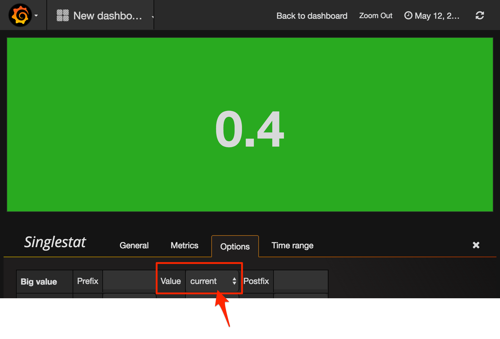
Here I’ve added a Singlestat panel. A very important thing to change from the default option if you’re using it in this way, to show the current value - is to make sure you set it to that - current:

If you don’t do this, you get the average across all values, which typically of less use.
The Singlestat panel also supports thresholds, so you can be alerted visually if the ingest rate is less than you’d want. Here it’s up to you to know what rate you would expect. In this screenshot it’s going to show green above 10, amber above 5, and red below 5:

In actuality, my ingest rate is pretty modest, at around 0.5 per second, so I’ve set my thresholds at 0.1 and 0.5. Anything below 0.5 I want to be aware of, anything below 0.1 and it suggests there’s a problem. Let’s see how that pans out.
To start with, everything’s good. Rate is above 0.5, and we’re ticking along nicely:

For some reason, the ingest rate slows - could be my source, could be the pipeline - but I want to be aware. The Singlestat colour highlights this for me, since it’s below the threshold of 0.5 that I set:

Now, let’s cut the pipeline and see what happens. We should get a nice big red alert background.

Oh. Not what we wanted. Even though the chart clearly shows there’s been no data for ten minutes, the Singlestat is showing a current ingest rate of 0.4 (and in amber, not red), and if you look closely the “Current” value on the legend shows the same.
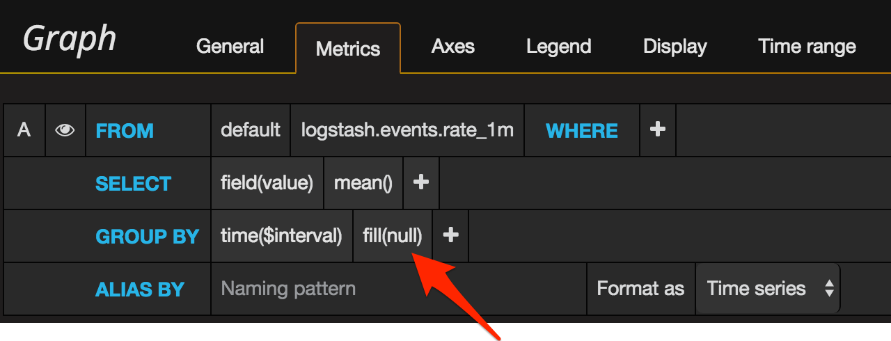
This is where we need to get a bit deeper into Grafana. If you look closely at the Metrics configuration for both the Graph and Singlestat, you’ll see that by default “fill” is set to null.

This is a time series chart, where time moves on whether you like it or not – and whether you have data or not. Grafana by default will ‘fill’ any gaps with null. Null is most definitely not zero – it’s null, it’s an absence of data, it’s “we don’t know”. So when we ask Grafana to use “current” value (in the legend, in the singlestat), it ends up using the “last known” value of the data - which for our purposes is stale and basically wrong.
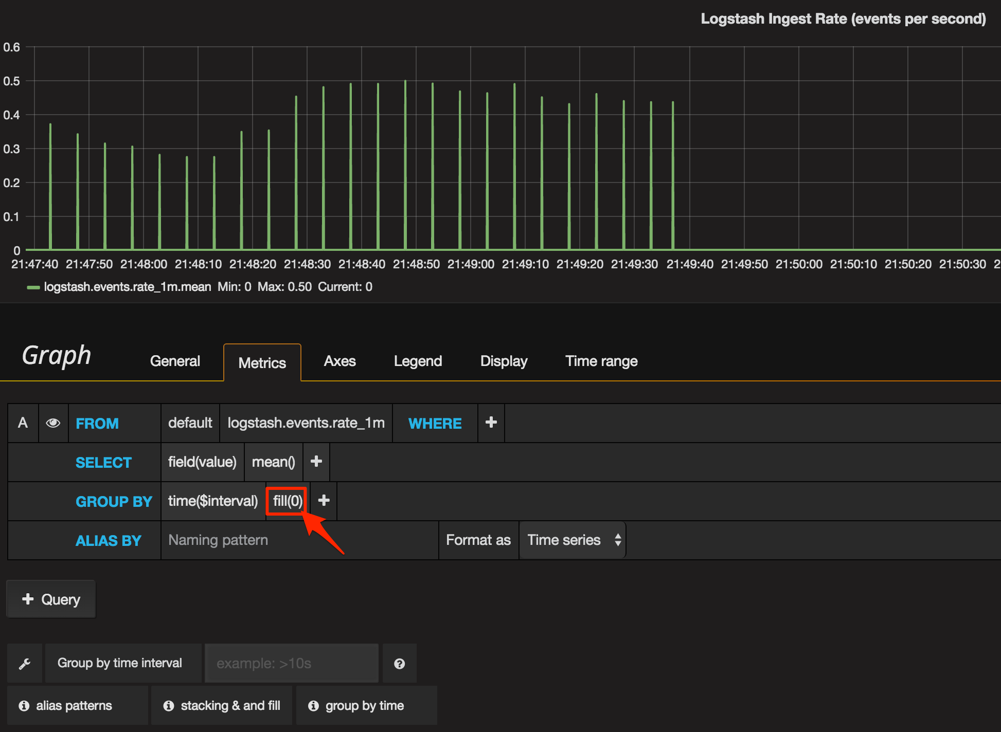
So in this case, we’re going to deliberately conflate “no ingest rate from Logstash” with “Logstash isn’t ingesting data”. Technically, this could be untrue at times, but it’s close enough for me. So now we will tell Grafana to use zero if it doesn’t find any data for a given time period.

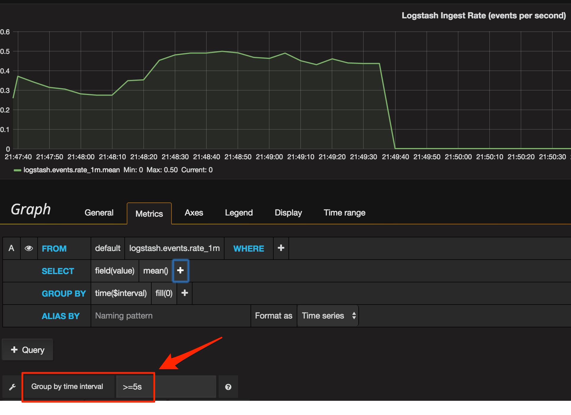
You’ll notice the graph’s rendering different now, because Grafana’s plotting it at a resolution higher than we’re sending data. Logstash emits the event data every five seconds or so, and Grafana’s plotting at every second - so it’s marking the chart as zero for every four of each five seconds. To solution to this is to set the time group by to at least five seconds:

Applying the same Metric configuration (fill=zero, group by >=5s) to the Singlestat panel gives us a much better result now. When there’s no data, we get a big fat red zero making it nice and clear that there’s a problem.

For the final touch, let’s give an indication on the chart of the threshold levels we’re using for the Singlestat, using the Thresholds option:

This shows itself on the chart as a coloured background for each threshold level used:

(From this we can see probably 0.5 is too high a threshold since the data seems to usually fall within that range - and there’s nothing worse than a permanent “warning” that just becomes background noise.)
So there you go - nice monitoring of Logstash ingest rates, using InfluxDB and Grafana. Stick around to see how we can do a similar thing for monitoring Elasticsearch, and even the data within it too…
