
At Current 2022 the audience was given the option to submit ratings. Here’s some analysis I’ve done on the raw data. It’s interesting to poke about it, and it also gave me an excuse to try using DuckDB in a notebook!
Tool Choice?! 🔗
When you’ve got a hammer, everything looks like a nail ;-)
DuckDB has kinda caught my imagination with the idea that it’s embedded and so easy to unleash really powerful SQL support on any unsuspecting data that passes its way.
I like the concept of using notebooks because you can show all your working and thought process. I wanted somewhere to work with the raw data, which was either going to be Google Sheets or Excel probably – or something with SQL. The advantage of not using Google Sheets is that I have a step-by-step illustration of how I’ve gone about wrangling the data which makes my life easier next time. It’s also a fun way to explore and show-off some of the things you can do with DuckDB via Jupyter :)
You can check out the raw notebook here. The rest of this blog is basically written from it :)
DuckDB Notebook setup 🔗
On my local machine I used Docker to run the notebook:
docker run -p 8888:8888 \
  -v ~/Downloads:/home/jovyan/work
  jupyter/datascience-notebook
Everything else quoted here is what I ran directly in the notebook itself. To start with I installed the dependencies that I’d need (based on the DuckDB docs):
import sys
!{sys.executable} -m pip install duckdb notebook pandas ipython-sql SQLAlchemy duckdb-engine
Import the relevant libraries.
import duckdb
import pandas as pd
import sqlalchemy

# Import ipython-sql Jupyter extension to create SQL cells
%load_ext sql
Some config and stuff:
%config SqlMagic.autopandas = True
%config SqlMagic.feedback = False
%config SqlMagic.displaycon = False
Now connect to an instance of DuckDB. You can use it in-memory (%sql duckdb:///:memory:) but I wanted to persist the data that I was loading and working with so specified a path that was mounted in the Docker container to my local machine:
%sql duckdb:////work/current_data.duckdb
Load the raw data 🔗
The data was provided in an Excel sheet which I’ve exported to a CSV file and put in the path that’s mounted to the Docker container under /work
%%sql

create table raw_data as
    select * from read_csv_auto('/work/Current 2022_Session Rating Detail.xlsx - Sheet 1.csv');
| Count | |
|---|---|
| 0 | 2416 |
The row count here 👆️ matches the row count of the source file ✅
Now let’s see what the schema looks like. It’s automagically derived from the CSV column headings and field values.
%%sql

describe raw_data;
| column_name | column_type | null | key | default | extra | |
|---|---|---|---|---|---|---|
| 0 | sessionID | INTEGER | YES | None | None | None |
| 1 | title | VARCHAR | YES | None | None | None |
| 2 | Start Time | VARCHAR | YES | None | None | None |
| 3 | Rating Type | VARCHAR | YES | None | None | None |
| 4 | Rating Type_1 | VARCHAR | YES | None | None | None |
| 5 | rating | INTEGER | YES | None | None | None |
| 6 | Comment | VARCHAR | YES | None | None | None |
| 7 | User ID | INTEGER | YES | None | None | None |
| 8 | First | VARCHAR | YES | None | None | None |
| 9 | Last | VARCHAR | YES | None | None | None |
| 10 | VARCHAR | YES | None | None | None | |
| 11 | Sponsor Share | VARCHAR | YES | None | None | None |
| 12 | Account Type | VARCHAR | YES | None | None | None |
| 13 | Attendee Type | VARCHAR | YES | None | None | None |
Let’s wrangle the data a bit.
It’d be nice to get the Start Time as a timestamp (currently a VARCHAR). Everything else looks OK from a data type point of view.
We’ll also drop some fields that we don’t need or want. For example, we don’t want sensitive information like the names of the people who left the ratings.
Converting the VARCHAR timestamp field to a real TIMESTAMP 🔗
Let’s first check some of the values and check out the nifty SAMPLE function
%%sql

SELECT "Start Time" FROM raw_data USING SAMPLE 5;
| Start Time | |
|---|---|
| 0 | 10/4/22 13:00 |
| 1 | 10/4/22 9:00 |
| 2 | 10/4/22 8:00 |
| 3 | 10/4/22 10:00 |
| 4 | 10/5/22 8:00 |
So the format is a mixture of US date (month / day / year) and 24hr time.
Before going ahead with the transform let’s just do a dry-run to make sure we’ve got our format string correct. (I just noticed on that page too that I could have specified this at the point at which the CSV file was read)
%%sql

SELECT "Start Time",
       strptime("Start Time",'%-m/%-d/%-y %-H:%M') as start_ts,
       strftime(strptime("Start Time",'%-m/%-d/%-y %-H:%M'), '%-H:%M') as start_time
  FROM raw_data
USING SAMPLE 5;
| Start Time | start_ts | start_time | |
|---|---|---|---|
| 0 | 10/4/22 17:15 | 2022-10-04 17:15:00 | 17:15 |
| 1 | 10/5/22 9:00 | 2022-10-05 09:00:00 | 9:00 |
| 2 | 10/4/22 11:15 | 2022-10-04 11:15:00 | 11:15 |
| 3 | 10/4/22 14:15 | 2022-10-04 14:15:00 | 14:15 |
| 4 | 10/4/22 12:15 | 2022-10-04 12:15:00 | 12:15 |
Ratings are left by different types of attendee 🔗
The system categorised attendees not only as in-person or virtual, but also based on whether they were sponsors, etc.
I’m just interested in “was the person there” or “was the person watching it on their computer elsewhere”?
%%sql

WITH A AS (
SELECT CASE WHEN "Attendee type"='Virtual'
             THEN 'Virtual'
             ELSE 'In-person' END AS attendee_type
  FROM raw_data)

SELECT attendee_type,count(*) as ratings_ct FROM A group by attendee_type;
| attendee_type | ratings_ct | |
|---|---|---|
| 0 | In-person | 1879 |
| 1 | Virtual | 537 |
Go Go Gadget 🔗
Let’s transform the data!
%%sql

DROP TABLE IF EXISTS current_ratings;

CREATE TABLE current_ratings AS
    SELECT  SessionID as ID,
            title AS session,
            strptime("Start Time",'%-m/%-d/%-y %-H:%M') as start_ts,
            CASE WHEN "Attendee type"='Virtual'
                 THEN 'Virtual'
                 ELSE 'In-person' END AS attendee_type,
            "Rating Type" as rating_type,
            rating,
            comment
    FROM    raw_data;
| Count | |
|---|---|
| 0 | 2416 |
%%sql

DESCRIBE current_ratings;
| column_name | column_type | null | key | default | extra | |
|---|---|---|---|---|---|---|
| 0 | ID | INTEGER | YES | None | None | None |
| 1 | session | VARCHAR | YES | None | None | None |
| 2 | start_ts | TIMESTAMP | YES | None | None | None |
| 3 | attendee_type | VARCHAR | YES | None | None | None |
| 4 | rating_type | VARCHAR | YES | None | None | None |
| 5 | rating | INTEGER | YES | None | None | None |
| 6 | Comment | VARCHAR | YES | None | None | None |
%%sql

SELECT id, start_ts, attendee_type, rating_type, rating FROM current_ratings USING SAMPLE 5;
| ID | start_ts | attendee_type | rating_type | rating | |
|---|---|---|---|---|---|
| 0 | 81 | 2022-10-05 09:00:00 | In-person | Overall Experience | 5 |
| 1 | 136 | 2022-10-04 10:00:00 | Virtual | Content | 5 |
| 2 | 151 | 2022-10-05 15:00:00 | Virtual | Content | 5 |
| 3 | 140 | 2022-10-04 11:15:00 | In-person | Presenter | 5 |
| 4 | 87 | 2022-10-05 09:15:00 | In-person | Overall Experience | 5 |
Here comes the analysis 🔗
1. Was there a noticable difference between ratings given by virtual attendees vs in-person? 🔗
%%sql

SELECT attendee_type, rating_type, MEDIAN(rating)
  FROM current_ratings
GROUP BY attendee_type, rating_type;
| attendee_type | rating_type | median(rating) | |
|---|---|---|---|
| 0 | In-person | Content | 5.0 |
| 1 | In-person | Overall Experience | 5.0 |
| 2 | In-person | Presenter | 5.0 |
| 3 | Virtual | Presenter | 5.0 |
| 4 | Virtual | Content | 5.0 |
| 5 | Virtual | Overall Experience | 5.0 |
A median score of 5 out of 5 tells us that the ratings were high across the board - but hides the nuances of the data. We could apply further percentile functions, but this is where visualisation comes into its own.
Using bokeh and altair for visualisation 🔗
Import the bokeh libraries
from bokeh.plotting import figure, show
from bokeh.transform import jitter
from bokeh.transform import factor_cmap, factor_mark
from bokeh.models import HoverTool

output_notebook(hide_banner=True)
Load the ratings data into a dataframe for visualising
%%sql

attendee_df << SELECT *, strftime(start_ts, '%H:%M') as start_time FROM current_ratings ;
Returning data to local variable attendee_df
Use bokeh to plot the ratings, by rating type and attendee type
p = figure(y_range=sorted(attendee_df.rating_type.unique()),
           sizing_mode="fixed",
           toolbar_location=None,
          title='Current 22: Ratings Distribution, broken down by attendee and rating type')


ix=factor_cmap('attendee_type',
                palette=['green', 'orange'],
                factors=sorted(attendee_df.attendee_type.unique()))

p.scatter(x=jitter('rating',0.4),
          y=jitter('rating_type',0.2,range=p.y_range),
          color=ix,
          source=attendee_df,
          size=9,
          alpha=0.4,
         legend_group='attendee_type')
show(p)
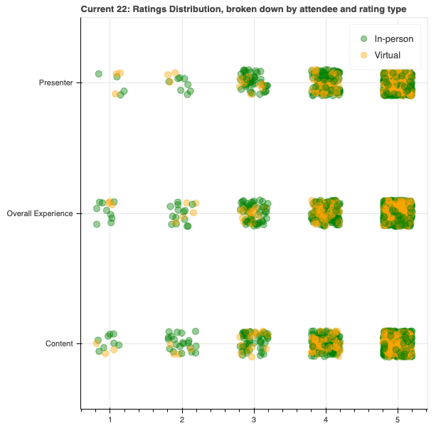
This shows us that the concentration of the ratings were certainly favourable. Let’s take another angle on it and use a histogram instead of scatterplot. For this I switched to altair because it supports the aggregation of data (using count()) which I’d need to figure out how to do otherwise with the dataframe - and that’s one step of yak-shaving too far for today…
import altair as alt

chart = alt.Chart(attendee_df).mark_bar().encode(
   column=alt.Column(
       'rating',
       header=alt.Header(orient='bottom')
    ),
   x=alt.X('rating_type', axis=alt.Axis(ticks=False, labels=True, title='')),
   y=alt.Y('count()', axis=alt.Axis(grid=False)),
   color='attendee_type'
).configure_view(
    stroke=None,
)

chart.display()

This is OK, but it’s the absolute values, of which there are disproportionally more for in-person than virtual. Can we plot the values as a percentage instead?
I hit the extent of my altair understanding here (I think transform_joinaggregate might have helped but I got impatient), so resorted to SQL to help instead.
DuckDB supports window functions (and has a rather good docs page to explain some of the concepts). I needed the total number of ratings by attendee_type so that I could work out the percentage of each of the counts, and this is what sum(count(*)) over (partition by attendee_type) gave me. First, I’ll check the numbers that I’m expected;
%%sql

SELECT attendee_type, count(*)
FROM current_ratings
GROUP BY attendee_type;
| attendee_type | count_star() | |
|---|---|---|
| 0 | In-person | 1879 |
| 1 | Virtual | 537 |
and then use the window function with the above numbers to check that it’s what I’m expecting.
Note the use of CAST…AS FLOAT — without this the numbers stay as integers and resolve to a big long list of zeroes…
%%sql

SELECT  attendee_type, rating_type, rating, count(*) as rating_ct,
        sum(count(*)) over (partition by attendee_type) as total_attendee_type_ratings,
       (cast(count(*) as float) / cast(sum(count(*)) over (partition by attendee_type) as float))*100 as rating_attendee_type_pct
FROM current_ratings
GROUP BY attendee_type, rating_type, rating
ORDER BY rating_type,rating_attendee_type_pct DESC
FETCH FIRST 10 ROWS ONLY;
| attendee_type | rating_type | rating | rating_ct | total_attendee_type_ratings | rating_attendee_type_pct | |
|---|---|---|---|---|---|---|
| 0 | In-person | Content | 5 | 428 | 1879 | 22.778072 |
| 1 | Virtual | Content | 5 | 108 | 537 | 20.111732 |
| 2 | Virtual | Content | 4 | 46 | 537 | 8.566109 |
| 3 | In-person | Content | 4 | 111 | 1879 | 5.907398 |
| 4 | Virtual | Content | 3 | 16 | 537 | 2.979516 |
| 5 | In-person | Content | 3 | 48 | 1879 | 2.554550 |
| 6 | In-person | Content | 2 | 21 | 1879 | 1.117616 |
| 7 | Virtual | Content | 2 | 4 | 537 | 0.744879 |
| 8 | Virtual | Content | 1 | 3 | 537 | 0.558659 |
| 9 | In-person | Content | 1 | 8 | 1879 | 0.425758 |
Now we can load it into a dataframe and plot it like we did above
%%sql

ratings_df << SELECT  attendee_type, rating_type, rating, count(*) as rating_ct,
        sum(count(*)) over (partition by attendee_type) as total_attendee_type_ratings,
       (cast(count(*) as float) / cast(sum(count(*)) over (partition by attendee_type) as float))*100 as rating_attendee_type_pct
FROM current_ratings
GROUP BY attendee_type, rating_type, rating
ORDER BY attendee_type,rating_attendee_type_pct DESC;
Returning data to local variable ratings_df
Let’s plot the data with altair and facet the charts for ease of readability:
import altair as alt
from altair.expr import datum

base = alt.Chart(ratings_df).mark_bar().encode(
        column='rating',
        x=alt.X('attendee_type', axis=alt.Axis(ticks=False, labels=True, title='')),
        y=alt.Y('rating_attendee_type_pct', axis=alt.Axis(grid=False)),
        color='attendee_type',
        tooltip=['rating', 'rating_attendee_type_pct', 'attendee_type', 'rating_type']

)

chart = alt.hconcat()
for r in sorted(ratings_df.rating_type.unique()):
    chart |= base.transform_filter(datum.rating_type == r).properties(title=r)
chart.display()

Analysis conclusion: 🔗
Across all three ratings categories, there is a marginal but present difference between how in-person attendees and virtual attendees rated sessions. Those in-person were more likely to rate a session 5 whilst those attending virtually did predominantly rate sessions 5 but if not 5 then more often 4 than those in person.
Analysis: Did Ratings vary of the course of the Day? 🔗
Probably not a very scientific study, but with 7+ tracks of content and two days’ worth of samples, here’s how it looks if we take an average of the rating per timeslot:
%%sql

df << SELECT  strftime(start_ts, '%H:%M') as start_time,attendee_type, avg(rating) as avg_rating
FROM current_ratings
WHERE rating_type='Overall Experience'
GROUP BY  start_time, attendee_type
ORDER BY start_time, attendee_type ;
import altair as alt
from altair.expr import datum

chart = alt.Chart(df).mark_line(opacity=0.8,width=10).encode(
        x='start_time',
        y=alt.Y("avg_rating:Q", stack=None),
        color='attendee_type'
)

chart

It’s not a great plot because the data is lumpy; some sessions were 45 minutes and other 10 minutes. Let’s see if the range framing in DuckDB will help us here to smooth it out a bit with a rolling hourly average:
%%sql

df << SELECT attendee_type, start_ts, strftime(start_ts, '%H:%M') as start_time, strftime(start_ts, '%d %b %y') as date,
        AVG(rating) OVER (
        PARTITION BY attendee_type
        ORDER BY start_ts ASC
        RANGE BETWEEN INTERVAL 30 MINUTES PRECEDING
                  AND INTERVAL 30 MINUTES FOLLOWING)
        AS avg_rating
FROM current_ratings
ORDER BY 1, 2;
import altair as alt
from altair.expr import datum

chart = alt.Chart(df).mark_line(opacity=0.8,width=10).encode(
        x='start_time',
        y=alt.Y("avg_rating:Q", stack=None),
        color='attendee_type', column='date'
)


chart

That’s much better. It also shows the scale isn’t so useful, so let’s adjust that
import altair as alt
from altair.expr import datum

chart = alt.Chart(df).mark_line(opacity=0.8,width=10).encode(
        x='start_time',
        y=alt.Y("avg_rating:Q", stack=None,scale=alt.Scale(domain=[2.5, 5])),
        color='attendee_type', column='date'
)


chart

Observations:
- Virtual attendees got happier as day 1 (4th Oct) went on.
- Something happened around 13:00 on day 2 (5th Oct) that upset the Virtual attendees but not those in-person—perhaps a problem with the livestream? Let’s remember that the scale here has been magnified, so this “drop” is only relative.
Let’s have a look at the second point here and see if we can figure out what’s going on.
%%sql

select start_ts, rating, comment
from current_ratings
where start_ts between '2022-10-05 12:00:00' and '2022-10-05 13:00:00'
  and attendee_type='Virtual'
| start_ts | rating | Comment | |
|---|---|---|---|
| 0 | 2022-10-05 13:00:00 | 1 | this session makes no sense here |
| 1 | 2022-10-05 13:00:00 | 5 | Great job connecting with the audience. Great ... |
| 2 | 2022-10-05 13:00:00 | 5 | None |
| 3 | 2022-10-05 13:00:00 | 4 | None |
| 4 | 2022-10-05 13:00:00 | 5 | None |
| […] | |||
Here’s the fun thing about conference feedback: it’s patchy, it’s completely subjective - and it’s often contradictory. These are comments for the same session - one person loved it, the other thought it shouldn’t have even been on the agenda. Whaddya gonna do? ¯\_(ツ)_/¯